Home
Case studies
Proven results
Work together
Blog
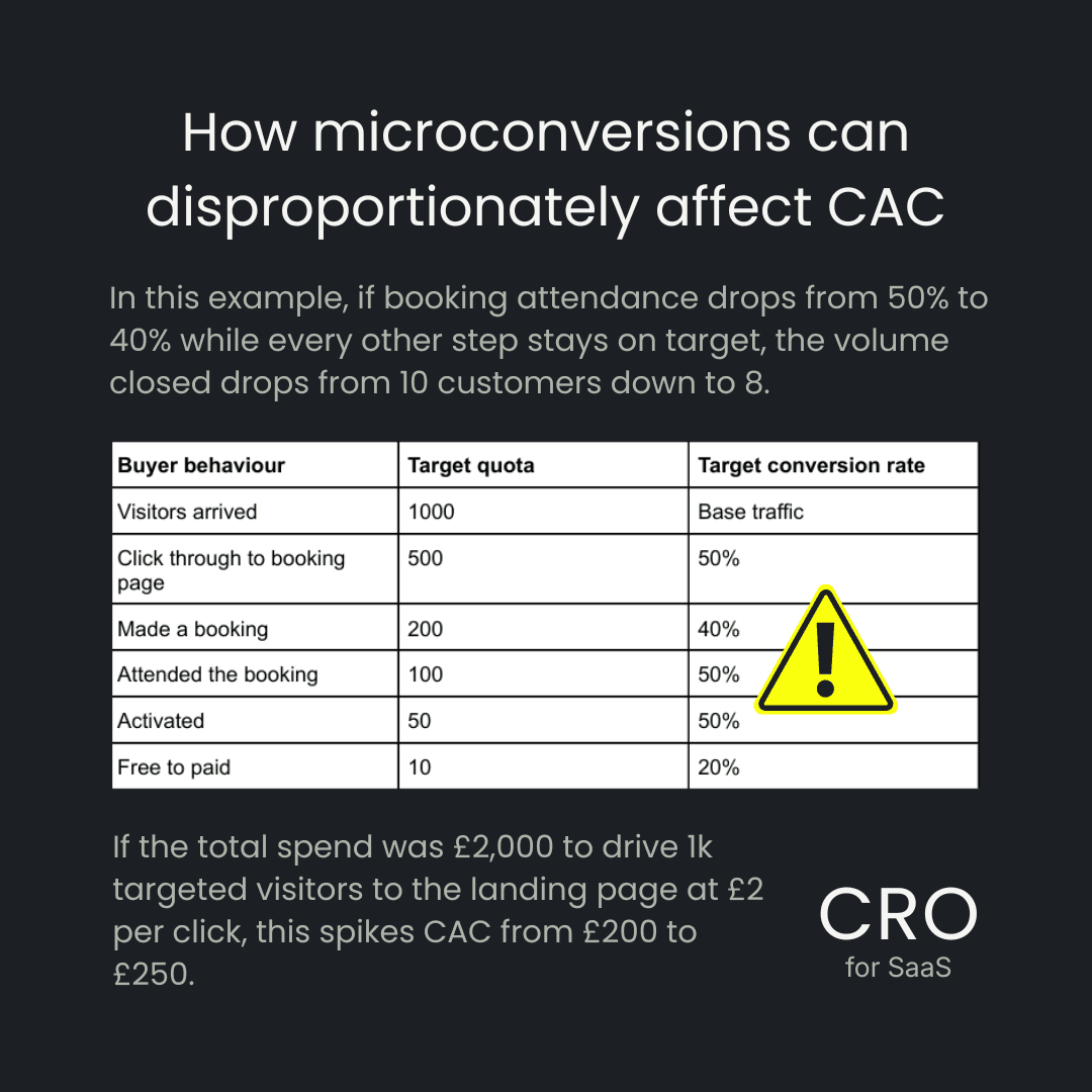
Deep dive analysis of common SaaS funnel revenue leaks and messaging challenges
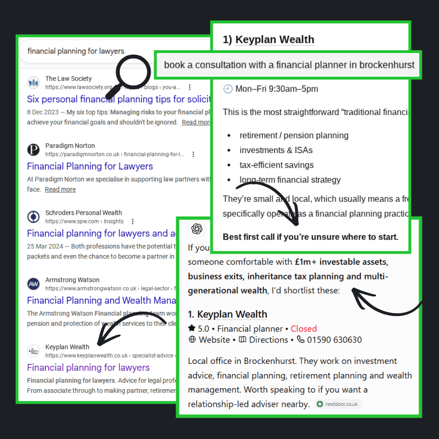
Overview of ongoing CRO and acquisition strategy for wealth management
Diagnosis of bottlenecks and restraints in an early-stage SaaS funnel